Tableau introduced level of detail (LODs) equations with Tableau 9.0, and with it came a huge number of new use cases. LODs are an easy alternative to table calculations when looking for two-pass aggregations. They don’t depend (much) on your viz layout, making them more easily reusable than table calcs. One of the coolest pieces of functionality, however, is the flexibility provided with filters. The addition of FIXED calculations gave Context filters additional functionality by adding something between Context filters and Dimension filters in the Tableau Order of Operations.
In short, the additional functionality could be summarized by two sentences.
- FIXED calculations compute before filters.
- Context filters still impact FIXED equations.
For most use cases, this holds true: FIXED equations gave us a new layer of computation between filter levels. If you play around with filters for long enough, however, you’ll note that there are times this isn’t true. Take the below example. I’ve written three calcs.
- SUM([Sales])
- {FIXED [Region] : SUM([Sales])}
- {FIXED : SUM([Sales])}
With nothing else on the viz, these all return the same results, as expected. Filtering on State, however, returns surprising results.

Even though Dimension filters come after FIXED expressions in the order of operations, we can see that a Dimension filter has impacted the results of a FIXED equation…but not both FIXED equations. What’s happened here? The short answer is that our filter filtered out the entirety of a Region, and we have an equation FIXED on Region. The longer answer requires understanding how LODs work and a look at the SQL issued by FIXED calculations.
At its core, Tableau takes your drag-and-drop commands and turns them into SQL. There are tons of great resources of Tableau for the SQL writer available, so we’ll look specifically at the SQL issued by FIXED commands here.
When we drag a normal metric to a visualization, Tableau issues a query which is SELECT SUM(Metric) GROUP BY <list of dimensions on viz>. The combination of dimensions on the visualization is what we call the “visualization level of detail” and determines the granularity of displayed data. Declaring dimensions in an LOD allows us to create a different level of detail for the calculation itself. At the end of the day, of course, the LOD is displayed on a chart, so we need to reconcile the viz level of detail with the calculation level of detail. In this case, our Region calc is at a more granular level than our viz, so Tableau aggregates up for us. Looking at the SQL just for that calculation, we see the below. (I’ve cleaned up the SQL just because Tableau has some funny re-aliasing that goes on. This isn’t verbatim what Tableau issues, but it’s the same query.)
SELECT SUM(t1.LODCalc)
FROM (
   SELECT Region AS Region,
   SUM(Sales) AS LODCalc FROM Orders
   GROUP BY Region
) t1
Tableau first selects our Sales per Region, then aggregates them all together. Because SUM is an additive metric, it returns the same as simply doing SUM(Sales). Now let’s look at the query when we add SUM(Sales) to the viz.
SELECT t2.LODCalc , t0.Sales
FROM (
   SELECT SUM(Sales) AS Sales
   FROM Orders
) t0
CROSS JOIN (
   SELECT SUM(t1.Metric) AS LODCalc
   FROM (
      SELECT Region, SUM(Sales) AS Metric
      FROM Orders
      GROUP BY Region
   ) t1
) t2
Again, let’s walk through it step by step. First, Tableau creates a table of sales by region (and names it t1). Because our viz is at the full-table level, we don’t need this data disaggregated at all, so Tableau aggregates that up to a single row (and names it t2). Then, Tableau cross-joins that to the SUM(Sales) total. It results in a one-row table.
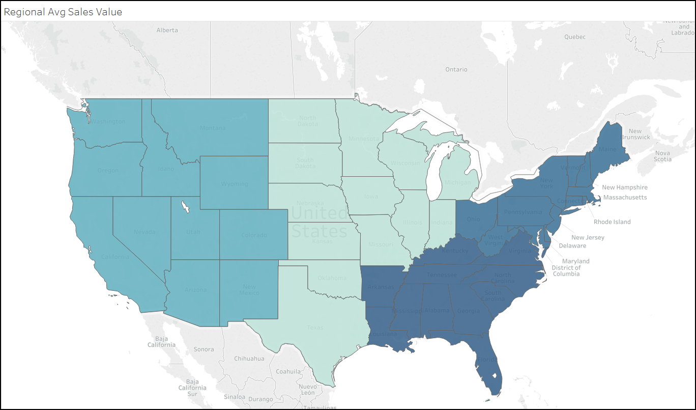
Now let’s look at it as a real use case. I want to know the average sales in the Region for each State. It’s simply {FIXED [Region} : AVG([Sales])}.
SELECT State, SUM(t1.RegionalAvg)
FROM (
   SELECT Region, State
   FROM Orders
   GROUP BY Region, State
) t0
 INNER JOIN (
    SELECT Region, AVG(Sales) AS RegionalAvg
    FROM Orders
    GROUP BY Region
) t1 ON t1.Region = t0.Region
GROUP BY State
This is where the important step first surfaces. When we use the LOD on a viz, we inner join the LOD portion back to the original data set on the dimension which we FIXED to. It’s the same step-by-step process as the SQL statements before.
- Create a table of AVG(Sales) per Region
- Join it back to our other data (in this case, just State name) on the appropriate dimension (in this case, Region)
In this case, we’re joining back on Region = Region. If we filter down to a specific state, however, the join won’t return the data from any other Regions. Our INNER JOIN on Region = Region now only returns data from the specific State we filtered to. In this case, though, we only needed data from the South, because that’s all that’s being displayed on our viz.
If we weren’t looking at it at the State level, however, Tableau still loses the data. Let’s go back to the original chart with 3 bars. This time, I’ll filter just to Alabama.
The FIXED SUM(Sales) bar still returns our total sales. SUM(Sales) returns just the data from Alabama, as we expect. The FIXED Region calc, however, returns sales from the entire region that Alabama is a part of. Let’s look at the query for SUM(Sales) and FIXED Region together.
SELECT t3.RolledUp, t0.Sales
FROM(
  SELECT SUM(Sales) AS Sales
  FROM Orders
  WHERE State = 'Alabama'
) t0
   CROSS JOIN (
    SELECT SUM(t2.RegionalTotal) AS RolledUp
    FROM(
     SELECT Region
     FROM Orders
     WHERE State = 'Alabama'
     GROUP BY Region
   ) t1
  INNER JOIN (
  SELECT Region, SUM(Sales) AS RegionalTotal
  FROM Orders
  GROUP BY Region
) t2 ON t1.Region = t2.Region
) t3
Again, we can walk through this step by step. First, Tableau builds a table of Sales by Region (t2). Next, it joins that on to a list of our available states (t1) on Region = Region. In this case, we only have one state (Alabama) and therefore only one region (South). This is where the dimension filter impacts our LOD. We’ve computed the sales for each region…but when we start to bring it back to the viz, the data gets excluded by a simple dimension filter.
Circling back to the original point…is it fair to say that a FIXED equation isn’t impacted by a normal dimension filter? For most use cases, yes it is. If, however, we filter out (whether explicitly or coincidentally) an entire member of the dimension we’ve fixed to, Tableau won’t have any way to bring that data back. The whole concept is built on INNER JOINS, so we need the dimension to be present in our resulting data. Relying on FIXED equations to cheat your dimension filters is great as long as you’ve vetted your use case, but it isn’t a bullet-proof approach to LOD filtering.
