Enterprise Tooling in a Vibe-Code World

You may have watched the Tableau Conference 26 Keynote and seen Tableau talking about vibe-coding your own dashboards (or you didn’t, and you can watch it here).  Vibe-coding and enterprise tooling may seem to be opposites.  Tableau has a long-existing UI for rapid dashboard development, and vibe-coding is a natural-language-to-code experience.  What’s the overlap?

I’ll start with a not-that-hot take: AI has changed the way that we do dashboarding.

Time for another non-controversial statement: end users will use the tool that provides the least friction for them, and right now that means vibe-coding.

This could be streaming out some pretty lit dashboards, or creating the most lovable content purely through natural language.  So where does that leave Tableau?  In a world where typing a couple sentences can build a decent dashboard, why use enterprise applications at all?  We’ve seen impressive tooling for Tableau to be vibe-coded (Tableau finally releasing an XSD for files, Tableau’s MCP repo has a mysterious “authoring” branch, and my teammates are building Claude skills for TabNext), but even that just puts it on parity with other vibe-code solutions: you can build a dashboard using only English.  What sets Tableau apart in this world?

I won’t pretend to have a one-sentence, silver-bullet answer to that question, nor do I think that question will ever have a finished, static answer.  Over the next couple years, as AI continues to evolve and people continue to find their preferred workstreams (and as AI pricing inevitably rises exponentially), this answer will change.  In the interim, however, there are a lot of reasons to use Tableau not instead of vibe-coding, but as your tool for vibe-coding.

As with any enterprise tooling, we have to consider three audiences: the central IT portion who administers the tool, the end users who actually interact with it, and management who keeps asking for us all to move faster.  Each of these audiences derives something different from the new world of vibe-coded data apps.  Before we even do that, though, I want to look at what I believe vibe-coding’s real use is in a data apps world.

Why Vibe Code a Dashboard?

This question is fortunately simple to answer: vibe coding a dashboard is the fastest way to get something done.  Whether you have a handful of questions about your data or are trying to develop an enterprise data app, it’s pretty easy to type in a couple sentences and receive a data asset in return.  Sometimes you’ll want this in a simple format (a line chart of sales over time), and sometimes you’ll want something entirely bespoke (a pair of chord diagrams designed to look like a bicycle).

When Would You Vibe Code a Dashboard?

This question steps a bit outside of dashboards, and into a more generic vibe-code question.  It’s an effective tool for generating predictable, time-consuming work.  It can be a frustrating tool for detailed work.  Most people think of vibe-coding as a great way of prototyping, but not a way of delivering enterprise-ready assets, and I think that applies for vibe-coded dashboards.  Historically, a dashboard was probably 80% creation, 20% maintenance.  Vibe coding can be an incredible way to reduce the time investment for creation, but we want to make sure we can do it in a way that’s not at the expense of maintenance time.  Instant dashboard creation (but with massive ongoing maintenance overhead) is simply robbing Peter to pay Paul, not freeing up time in your day.

Before we go any further, it’s worth remembering why Tableau was invented 20-odd years ago: people needed easy access to data, and needed to be able to manipulate it.  They also needed to create trusted assets, so you could spend meetings doing something more productive than asking “Where’s that Excel doc from, and why do you think it’s more accurate than mine?”.  Just like with those Excel docs 20 years ago, proliferation of untraceable content will be a real problem if we don’t address it early, so we’ll start from a governance perspective.

Governance

  • Predictable, reusable assets – Everybody wants to vibe-code, but nobody wants to vibe-maintain.  When you build a data app using unpredictable frameworks, you don’t know the exact code that gets written.  Sure, you could pop open an editor and take a look, but nobody is poring through 1000s of lines of code to figure out exactly how their network chart was written in D3 (if it even used D3).  The assets that are built by vibe-coding a Tableau dashboard are:
    • Materialized in a predictable format.
    • Openable by Tableau desktop.
    • Editable in Tableau.
    • Inspectable and ingestable by Tableau (or third-party tooling) to understand the metadata

This means that everything can be logged, examined, and cross-referenced, no matter what you’re trying to accomplish.  Want to test out version control? Want a code editor to compare versions of a dashboard? Want to build tooling to see what your users care about, which dimensions are queried most often, and which metrics you no longer need?  You can’t do that on a network of data apps built in different code frameworks.

  • Data Governance – Your users will build dashboards and data apps.  If they’re doing so in the lightest-weight tool they could install, they’ll find a million ways to connect to data (CSV downloads, static queries, batch ingestion).  Sure, some of them will find a way to OAuth into Snowflake.  But will they remember to make that an interactive flow, or will they hard-code their own credentials?  How much do you trust your end users to do what’s right with the data rather than what’s expedient?  By building in Tableau, they’ll connect to the data you’ve curated there already.  Or, if necessary, you can vibe-code against a CSV, then move your analytical app onto a published datasource.  And that governance doesn’t just entail row-level security, but also refresh cadences, calculations, table relationships, and business semantics.  If you vibe-code in Tableau, you know that your dashboard shows the same numbers as the enterprise-standard dashboard, as well as the dashboard your neighbor is building.  This means you can show up to a meeting with your own dashboard, but feel confident it reflects the same data as everyone else’s.
  • Query Cost – This has always been true in Tableau, but it’s more important now than ever. How much does a dashboard load cost you in database compute? How many times are people going to build that dashboard, how optimized are the queries being sent, and oh god what grain of data is it bringing back? Tableau provides a governed, free-query layer in the form of Hyper extracts. Pay once to extract the data, then pay 0 for every future dashboard load, even as you go through a million conversations with Claude trying new formats, new chart types, and new dashboards. No matter what the agents do, rest easy that your query cost is flat.
  • Discoverability – Or “where did that data app live?”.  The easier a dashboard is to build, the more likely someone is to build it instead of finding an existing one.  Providing easily accessible, findable assets will actually reduce the likelihood of new assets being created.  Your choice: semantic search across an enterprise tool, or “I think Stephanie built the one I’m looking for, so maybe I’ll try stephanie.lovable.dev?  Maybe her github page?”  Which do you think is more likely to control your dashboard sprawl? Tableau was built as a dashboard development tool, but since the release of Server in 2007 it has also acted as a repository for all data questions.  As Tableau has roadmaps for things like semantic search and enterprise search, having all your data apps in one place will help stop dashboard proliferation.
  • Audit/Lineage – I know you, dear reader, work at a company where schema drift doesn’t exist and all back-end data projects were finished years ago, but imagine a world where table names change, columns disappear over time, and entire warehouses get retired.  In a decentralized world of custom apps, how do you know what will break when you change custName to Customer_Name?  Tableau provides this visibility.  It takes advantage of the predictable file structure and the centralized hosting location, so whatever changes in your data world…you’ll know the impact before you click Commit.  It’s built out in the Tableau Catalog, and it’s also available through APIs (and yes, you can vibe-code some queries against those APIs).  Vibe coding can create flexibility, but it will always be at the cost of visibility.

Ok, so this makes life better for a BI Admin and for IT.  Why should you care?  You just build the dashboards, someone else can deal with those problems!  It turns out that admins and end users both benefit from a lot of these same points.

Usability

This feeling was best crystallized to me by a teammate who pointed out that English is actually one of the least efficient ways we have of talking to computers.  It is massively flexible, but when you know what needs to be done, keyboard shortcuts and UI affordances are faster, more predictable, and more precise.  As we build vibe-coded applications, we often end up with mounds of spaghetti code that we don’t understand, and we lose the ability to actually make tweaks.  By having your LLM instead generate a Tableau file, you get the best of both worlds: AI for speed of frameworks, but UI for accuracy and precision.

  • Deliver Value, Not Flexibility – Over the last few years, we’ve increasingly seen dashboards referred to as “data apps”, and you’ll find me going back and forth between the terms.  At the end of the day, the purpose of a dashboard is to accomplish a specific task: this isn’t data philosophy, it’s action on the data that you find interesting.  Vibe-coded apps absolutely offer unlimited flexibility to the creator, but the lack of native integrations often means a sprawling set of charts, some of which interact, all of which are vaguely interesting, but none of which drives action.  By vibe-coding in Tableau, you make it easy to plug into existing applications, whether that is using the built-in actionability via TabNext or using Dashboard Extensions in traditional Tableau.  Use dashboards as applications to accomplish data tasks, not ways to pontificate about various patterns.

Now none of this is to say that all of your work should build assets in a Tableau format.  Tableau’s strength is its ability to produce re-usable, well-reasoned, code-based assets that represent massive visual flexibility…but there are charts that Tableau hasn’t always done well.  I’ve spent my time reviewing trig functions to figure out a Sankey chart, and I’ve had customers ask for radial sunburst charts that we could maybe hammer through, but would be better built in another framework.  This is where Tableau’s extensibility really starts to shine.  Tableau, through its extension frameworks, allows you to fully integrate those visualizations into an existing dashboard, while inheriting all of the upside of standardized tooling.  Build your entire dashboard on top of existing published data sources, and when it’s time to add a network chart, feel free to build it in D3 but plug it into your Tableau data using the Extensions API (or use something partner-built to save even more time).  You can enjoy all the flexibility that vibe-coding has made easy in code-first platforms, but integrate it into the same discoverable, governed framework that makes Tableau so powerful to begin with.

Vibe coding has changed the way we interact with software, and will continue to do so for years.  However, it doesn’t mean that we should abandon governance, predictability, and sharability.  If we abandon all the lessons we’ve learned over the last 20 years, we’ll move straight back into the world of people showing up to meetings with their own copy of an Excel doc.  Yes, your custom app is prettier than Excel, but it’s not more accurate, nor can I understand the moving pieces within it…you’re just in a prettier version of Excel Hell.  By harnessing the power of rapid development while staying within the frameworks of predictable outputs, I can get the best of both worlds and deliver governed, re-usable, sharable assets…on a timeline that my boss likes.

And as an admin? They say the best time to start on something you care about was twenty years ago, the next best time is today.  We’re now at a moment where we can choose: should we proactively govern the analytics platforms or watch a crippling number of data apps be created? Empower your users to vibe-code, but do it in a way that protects your ecosystem.  You need to know the data lineage that feeds their data apps, and you need to govern now, before you have 15,000 data apps answering the same questions.
All for Some, and Some for All

Row Level Security: Implementing “All Access” or “Deepest Granularity” methodologies

Virtual Connections, released last year, allowed Tableau an easy way to deploy row level security at scale. You can easily build governance policies in a single place, against a single table, and have them flow down to your entire organization. These policies can be easily audited and edited as your business needs change, and you can be assured that your changes will flow down to all content living downstream of the VConn. The only remaining hurdle is figuring out the appropriate policy for your data.

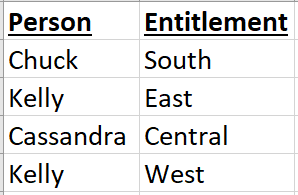
Tableau’s base recommendation for RLS is to create an entitlements table with one row per user per “thing they should access”, or entitlement. A sample table might look like the below.

For every Person, a Region, and for every Region, a Person.

This works perfectly well for a small group of users, and even scales well as your users and entitlements grow! Where it can begin to struggle, however, is when people have access to multiple regions. I’ve written a post for managing multi-entitlement access, but there’s another type of user it didn’t account for: the superuser. Whether it’s an exec, manager, or simply an entirely different business unit (analysts, for example), there’s often a swath of users who should be able to access everything. We could individually enumerate each user and give them access to every single entitlement, but imagine a scenario in which we have 15,000 entitlements and 15,000 users. Our entitlements table could balloon to tens of millions rapidly!

The old approach, detailed in our RLS whitepaper, required joining 2 additional tables to your fact table. VConns, as currently built, only allow for a single join, so this requires a new approach. Good news, though, it’s a relatively simple approach.

  1. Create a group on your Tableau Server for all of your “superuser” folks. I simply called mine “Superusers”. Add all of your superusers to this group.
  2. Add 1 row to your entitlements table with “Superuser” in both columns.
  3. Modify your fact table. There are a couple things we’ll have to do here.
    • Duplicate the column you use for your Entitlements join (the Region column, in my example).
    • Union your table to itself.
    • In the unioned copy of the table, replace all values in the Entitlements column with “Superuser”

I’ll show these modifications with some images. Consider the below fact table (only 3 rows).

I’ll union this table to itself, doubling the size (6 rows now). Add a new column for Entitlements (as a copy of the Region column). In rows 4-6, however, the Region has been replaced by the word “Superuser” in the entitlements column.

The green indicates rows added via the union, and are a perfect copy of the original fact table. The orange indicates the new column we’ve added for modified entitlements.

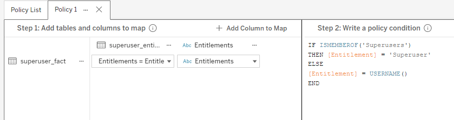
With this modified fact table, we’ll no longer need multiple joins. A single join in our VConn, with the appropriate policy, will now be sufficient to pass in all the info we need.

This policy first checks to see if a user is a superuser. If so, they get access to 1 entire copy of the dataset. If not, they’re subjected to the normal RLS rules.

So that’s how, but why?

If all you care about is getting the work done, read no further! If you’re curious about the query execution behind the scenes because you may want to further customize this solution, read on. It might seem like a bit of a convoluted approach at first glance. The simplest approach wouldn’t seem to require any data modification at all. Why not just write a policy which checks ISMEMBEROF(‘Superuser’) and, if true, returns the whole dataset?

The answer lies in join cardinality and join culling.

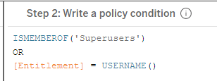
First, we’ll address join culling. There’s a tendency to assume that we could write a policy like the below, and use our base entitlements table.

We assume that if a user passes the ISMEMBEROF() check in our policy, the entitlements join will no longer happen. We’re not using the entitlements table for anything, so why bother joining it in? The way Tableau operates, however, means that once you’ve added the entitlement table to your policy, it will always be a part of your query, even if no columns are directly referenced in the policy. No matter what happens, the tables will join and the query will execute.

But why is that a problem? That answer comes from cardinality. If each row in your dataset can only be viewed by one person, and each person can only view one row, then you’ll actually be ok with this. Unfortunately, not many businesses are that simple. Most of the time, each user can view multiple rows, and each row can be viewed by multiple people. Take the simple example below, a 5-row entitlements table. It’s the same example from the beginning, but we’ve added one more user who can see the West region.

We now have 2 copies of “West” in the Entitlements columns of the Entitlements table. If we were to join this table to our fact table and query it, we’d end up doubling all the sales from the West. In a non-Superuser experience, however, this doesn’t matter. Tableau would first query the entitlements table to the appropriate user (let’s say Kelly, in this case) and then query the joined tables.

SELECT SUM(Sales) FROM sales JOIN entitlements ON sales.entitlement = entitlement.entitlement WHERE Person = 'Kelly'

The entitlements table would be filtered, the join would execute, and because there are now no duplicate values in the [entitlement.entitlement] column, no duplication occurs. Kelly sees the appropriate sales data. If, on the other hand, a Superuser logs in and queries, they’d receive the entire resulting table.

SELECT SUM(Sales) FROM sales JOIN entitlements ON sales.entitlement = entitlement.entitlement

In this case, there’s no WHERE clause, so they receive the unfiltered data. Because “West” appears twice in the [entitlement.entitlement] column, our sales in the West region get doubled. Of course, in practice, the impact will probably be much larger. There may be 5000 employees who can access the West region, and 3000 who can access the East. We’d have to do some silly math to try to reduce these numbers back to their de-duplicated state, and it would result in a lot of query overhead. Instead, we want to attempt to just query the raw, unduplicated fact table .

…and how does it work?

Really, a union is odd behavior to use here, because all we want to do is cull out the join. Because the join is unavoidable, however, we need to instead find a way to remove all duplication from the join. To do this, we unioned the fact table to itself. The duplication only happens when entitlements are joined together, so we need to make sure we don’t perform a many-to-many join. By materializing a single “Superuser” row in our entitlements table and creating a separate copy of the fact table that joins directly to it, we have effectively made a separate copy of the table for a superusers to query. The query we execute will be the same as above, but we’ve added a WHERE clause back on.

SELECT SUM(Sales) FROM sales JOIN entitlements ON sales.entitlement = entitlement.entitlement WHERE entitlement.entitlement = 'Superuser'

We know that ‘Superuser’ appears only once in our entitlements table (unlike the Region values, which may be repeated). As a result of this, we know that the fact table does not get duplicated. Our superusers see all of the data, but in its unduplicated glory!

You, Robot: Responsibly Democratizing AI

NB: In many contexts, AI and ML overlap but are distinct. In this post, I’m using them basically synonymously and completely interchangeably. Feel free to find/replace them all w/ the acronym of your choosing for a more pleasant reading experience.

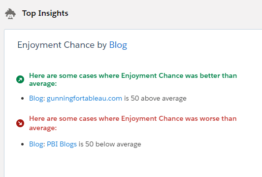
Tableau has just released an integration with Einstein Predictions, and there’s a ton to be explored and celebrated with that. It’s the first formal integration between Tableau and Salesforce stacks since the acquisition, it’s the easiest AI/ML in any BI product around, and it truly lowers the barrier to entry for people who know nothing about R, Python, etc. And it surfaces some great insights!

Who could argue with these insights?

But as we all know, with great power comes great responsibility. ML has the power to find new insights in our data, find new ways to optimize processes, maximizing profit and minimizing cost. It also has the potential to augment some of our worst flaws and augment existing biases. I recently re-read Cathy O’Neil’s phenomenal book “Weapons of Math Destruction” on the risks we take with ML, and it feels incredibly relevant to this situation. Many in the traditional Tableau userbase may have little experience with ML up until now (yes, we do love TabPy), so it’s worth highlighting some of her advice through a Tableau lens. Consider this my own take on her book, which you should read!

Two seminal works on the possible impacts of irresponsibly-deployed artificial intelligence.

The author lays forth 4 potential (and historical) problems with ML, and I’ve added on two of my own, along with my suggestions on how to approach each. Each of these, if followed, will help us create and deploy models that are not only more responsible but also more effective, removing detrimental human bias and adding efficiency wherever possible.

Her 4…

  • Scalability
  • Lack of Opacity
  • Model Regulation
  • Contestability

…and my own few…

  • Confusing Optimization for Innovation
  • Confusing Metrics and Targets

Scalability

This is literally the entire concept of creating citizen data scientists. We’re looking to allow more people to implement more data science in more places. It’s also the single biggest risk. Anything deployed irresponsibly can cause damage, but people’s inherent trust in AI and their willingness to “Set it and forget it” means that it can impact business processes at massive scale. O’Neil notes that the ease at which ML is scaled now (and the ease of scaling its impacts as well) means that irresponsible usage can have dangerous implication. Whether the negative impact is a social one (AI has been used to justify over-policing poor neighborhoods) or a business one (a poorly trained model could tell you to sell the wrong products to the wrong people), the ability to scale AI’s impact is also the ability to scale its potential for failure. Fear not! If attention is paid to the rest of her notes, ML can be deployed responsibly and in a helpful manner.

Opacity

Too often, ML models are trained on an entire dataset, deployed and accepted without appropriate documentation. A successful model should allow the end users to see what goes INTO it so they know they can trust what comes OUT of it. ML models are built entirely on training datasets, which are historical records. Historical records reflect our own biases in every way. These biases may be innocuous (an ML model would find that I should work harder before I’ve had my coffee) or massively impactful (ML models will reinforce histories of racism, sexism, and a whole host of -phobias). Avoiding opacity helps to build trust in your model, as well as allowing users to recommend additional variables that SHOULD be included in it. Even if we exclude the directly discriminatory elements, how many other elements correlate with those? Amazon was forced to scrap a hiring algorithm after it recommended not hiring attendees of all-female colleges. What proxies exist in your data, and how will you guard against them? Predictions helps with this in that it shows primary drivers of a prediction. Documenting the rest of your model is a key step to building trustworthy, effective models. Einstein’s ability to surface the reason for a prediction helps with accountability and transparency.

A prediction may not raise eyebrows until you look into the explanations behind it.

Difficult to Contest

ML models, at the end of the day, surface predictions, not sureties. They may seem similar, but it’s an important distinction. Especially when it comes to making high-impact decisions (remember that “impact” applies not only to the business, but the consumer as well), presenting AI projections as fact is irresponsible, and consumers should be protected from fully AI-based decisions.

Anecdotally, I was in southern Washington two weeks ago and we came to a cash-only toll bridge. We pulled over to an ATM to get $2 in cash. An AI system flagged our card as suspicious activity, and we spent 45 minutes on the phone with Charles Schwab just so we could be allowed access to our own money. In our case, this was harmless (we got ice cream and sat by the bridge) but automated denial of access to one’s own belongings could have serious consequences. What if there was a time-based need for the money? What if my phone was dead? Uncontestable or difficult-to-contest decisions deliver bad customer experience, can punitively impact the most vulnerable customers, and can set your AI implementation up for failure. Remember that AI is only profiling a set of dimensions, it can’t know the individual’s intent.

Optimize vs Innovate

An ML model is built to take our existing processes and tweak and hone them to perfection. Even if we deploy a model completely free of bias, at best it will only perfect our current process. To butcher a Henry Ford quote (it’s apocryphal anyway), “If we asked ML what it wanted, it would’ve optimized for faster horses”. ML isn’t here to invent the car! Allow ML to perfect your existing processes, but don’t pretend it’s a replacement for human innovation.

Use ML in tandem with what your users know about the business. Successful AI implementations in BI are a work in progress, but they’ll likely involve a balance of AI and human involvement. Allow AI to help fine-tune processes and expose wasted expenses, but allow the data consumers to find creative solutions to those problems in ways that AI can’t innovate. Better yet, put Einstein next to AskData to allow users the ability to explore the data with Einstein as a guide for which fields may be most important!

Convert AI Insights into exploratory guidelines with Einstein + AskData

Targets vs Metrics

Don’t allow yourself to confuse a target and a metric, because once a metric becomes a public target…it loses its value as a metric. If people are trying to attain a metric, rather than the outcome that the metric measures, you’ll optimize for the wrong scenario.

Imagine I build a model seeking to maximize profit, and it tells me I should sell direct to consumer, rather than through any third parties. I then publish this as a target for my internal salespeople, with a prize for whoever sells the highest % direct to consumer. A clever salesperson will win first prize (as you know, a Cadillac Eldorado) by simply not selling anything to a third party…but ultimately that may cut down their sales by so much that they have almost 0 profit. They’ve achieved the metric, but at the cost of the target. The book details an incredible example of how Baylor has cheated an equally flawed algorithm regarding the college admission process, and how it completely invalidates the models we began with. How do you avoid this scenario?

  1. Ensure that the model is being pointed at the desired outcome, not something that correlates with the desired outcome.
  2. Ensure that people implementing policy as a result of the model understand what the model does and doesn’t recommend.
  3. Align incentives with real-life outcomes. The scenario above should seek to maximize profit, not direct-to-consumer sales!

Overall, ML in BI creates a huge opportunity. Allowing casual business users to train and deploy models can unclog bottlenecks in your data science department, making data science available for all sorts of projects, not just the top-line massive-budget projects. Dashboard builders can use this to influence which dimensions they should ignore, and which they should dig in on. Casual consumers of dashboards get additional context as to why the data they’re looking at is important. Web Editors and AskData folks now have a way to drive their exploration towards a target, rather than wandering aimlessly through massive data models.

At the same time, the expanded userbase means an expanded base of people responsible for deploying models. These people should be taught about AI/ML, what “intelligence” really means in that capacity, and how it can be used to harm both people and businesses. Responsible deployment of AI isn’t a one-time effort, it’s an ongoing enablement of employees and inspection of models.